Why Mobile-First Web Design is Essential in 2025
The Mobile Revolution is Here
Over 60% of web traffic now comes from mobile devices, yet many businesses still design desktop-first. This outdated approach hurts both user experience and search engine rankings. Google's mobile-first indexing means your site's mobile version is what gets ranked—not your desktop version.
What is Mobile-First Design?
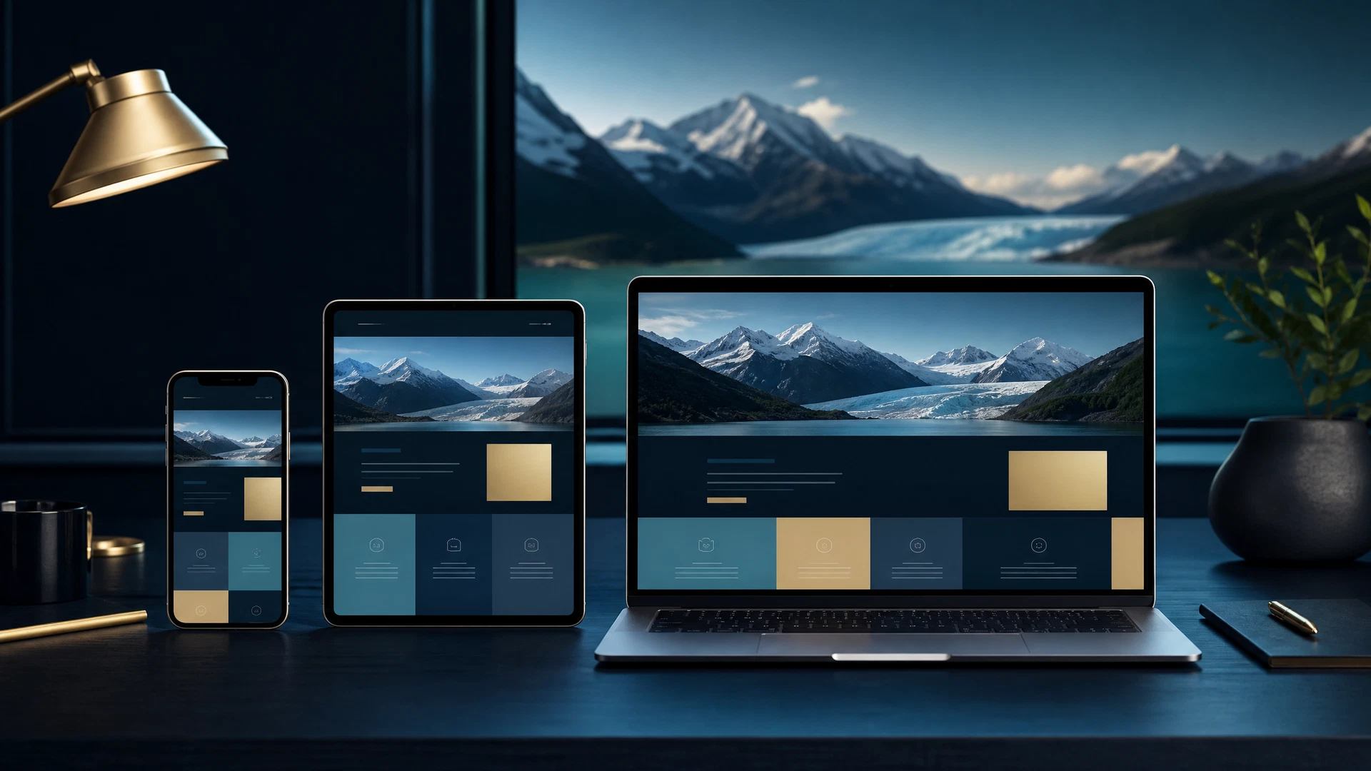
Mobile-first design means building your website for small screens first, then progressively enhancing it for larger screens. This approach forces you to prioritize essential content and functionality, resulting in faster, cleaner websites.
Key Benefits of Mobile-First Design
- Better SEO Rankings: Google prioritizes mobile-friendly sites in search results
- Improved User Experience: Faster load times and easier navigation on phones
- Higher Conversion Rates: Mobile users are more likely to convert when the experience is optimized
- Reduced Development Costs: Building mobile-first is often simpler than retrofitting
Mobile-First Best Practices
Start with a single-column layout that works perfectly on phones. Use touch-friendly buttons (at least 44x44 pixels), optimize images for mobile networks, and test on real devices. Avoid pop-ups and auto-playing videos that frustrate mobile users.
The Bottom Line
In 2025, mobile-first design isn't a trend—it's a requirement. If your website isn't optimized for mobile, you're losing customers to competitors who are. At Harris907, we design every website mobile-first to ensure your Alaska business reaches customers wherever they are.
Related Services
Explore All Our Services
Discover how Harris907 can help your Alaska business succeed online.
View All Packages